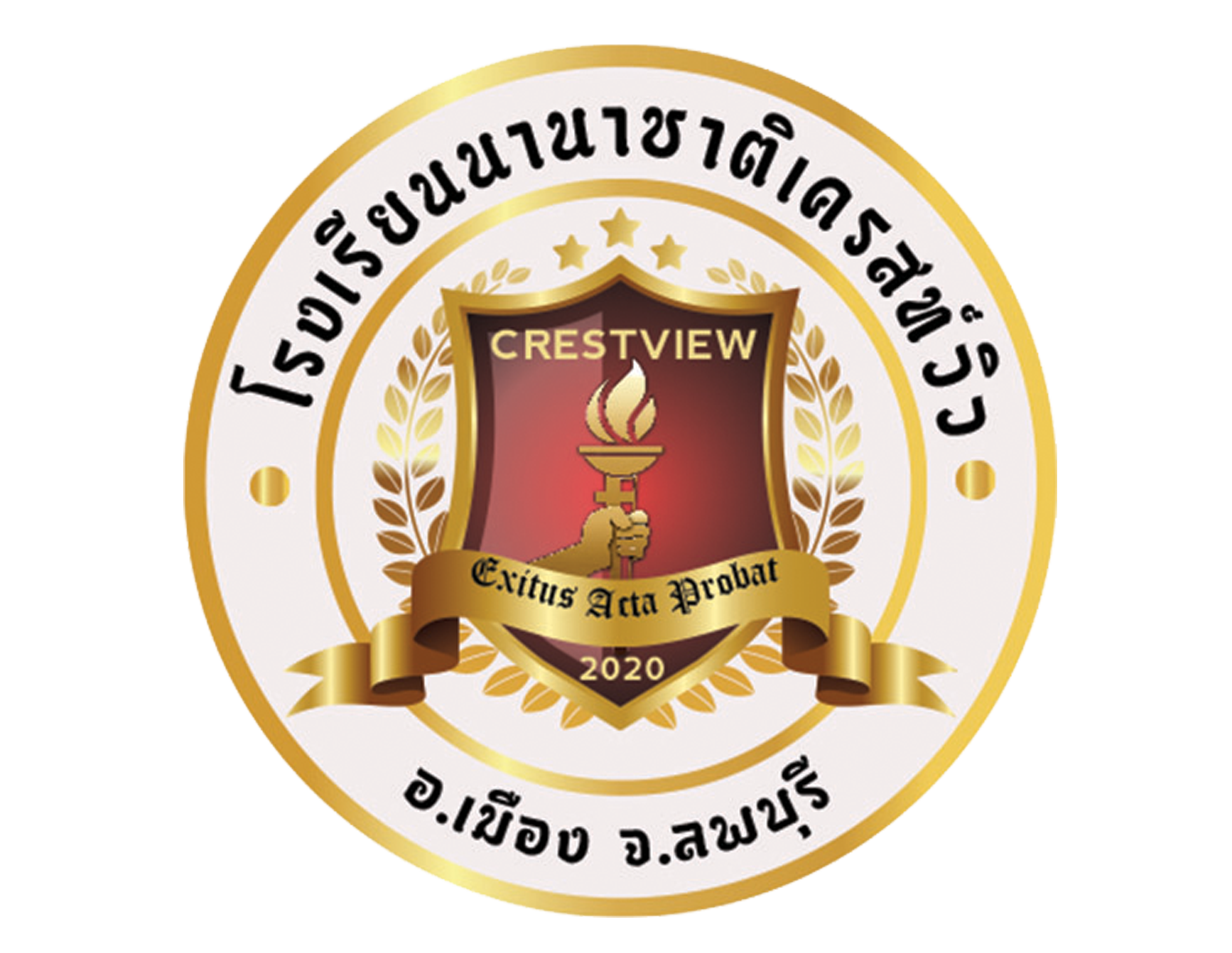
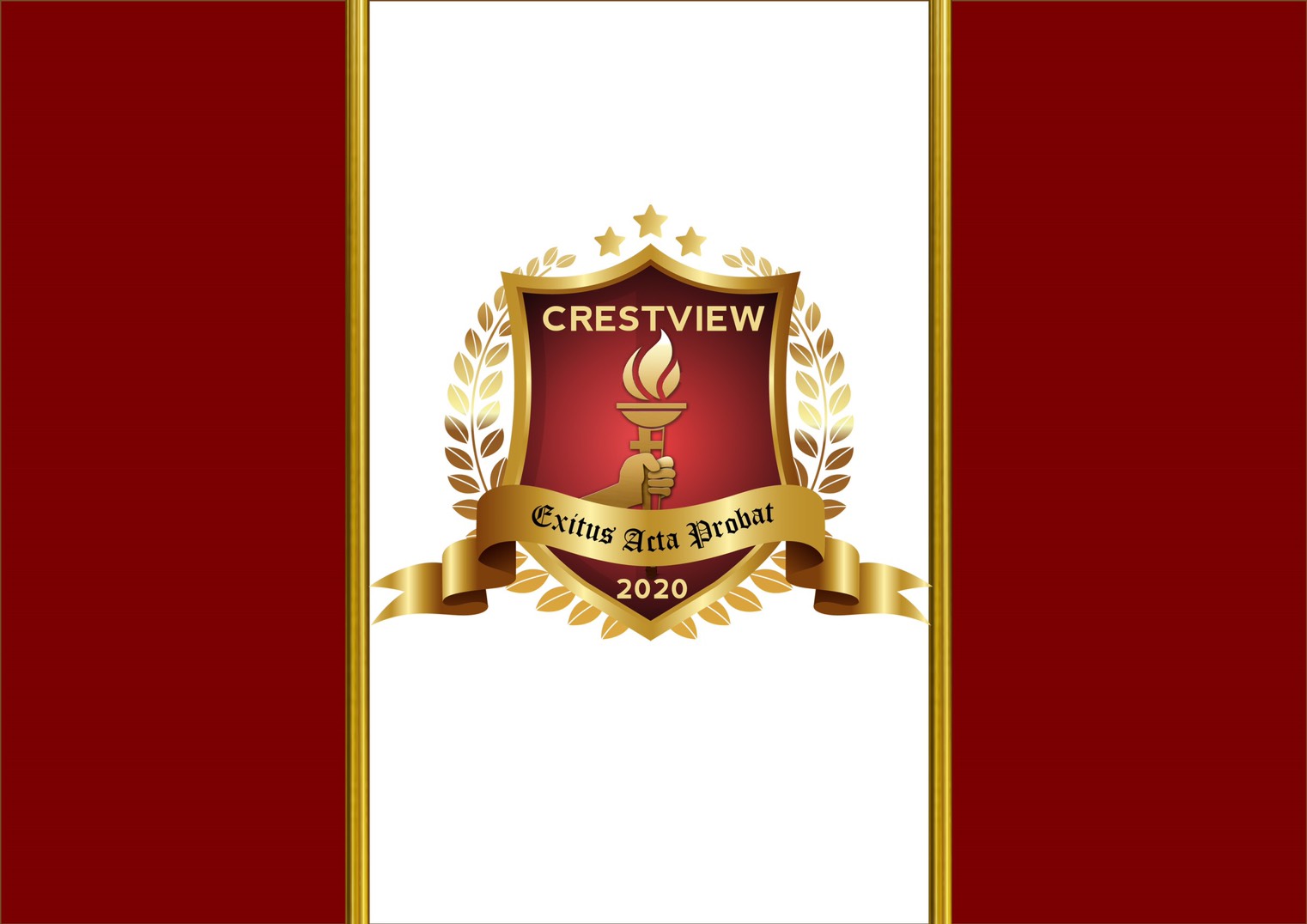
The Crestview International School’s emblem is not merely a design, but an embodiment of our school’s core principles, character, and ambitions. It symbolizes our identity, values, and aspirations, and serves as a powerful representation of our commitment to academic excellence, personal growth, and community engagement.
Our logo serves as a unifying symbol that inspires and motivates our students, faculty, staff, and alumni to strive towards excellence in education and personal development. Each element in the logo has a deep meaning that reflects the strong foundation upon which our institution is built.
The careful selection of the logo’s components represents our dedication to providing a safe, nurturing, and stimulating learning environment for our students. The emblem’s intricate details, colors, and shapes are designed to communicate the essence of our school’s mission, vision, and values.
Crestview International School’s shield represents the foundation of our institution, which is built on strength and protection, ensuring that students can learn and grow in a secure environment. The shield’s open book design signifies our commitment to freely sharing knowledge with our students and the wider community.
The color gold represents the highest standards of excellence, achievement, and success. At Crestview, we inspire and motivate our students to pursue their academic and personal goals with dedication and determination. The color red embodies the passion, energy, and enthusiasm that our faculty, staff, and students bring to the pursuit of education. It also symbolizes our commitment to fostering a vibrant and dynamic learning community.
The stars on our emblem honor the founders of our school and align with our school slogan: DISCOVER excellence, EMBRACE wellness, INSPIRE greatness. Each star represents the core values of our institution: excellence, wellness, and inspiration. The laurel wreath on our emblem represents victory, honor, and achievement. It signifies that Crestview International School is a place where students can achieve their full potential and emerge as victorious and accomplished individuals.
The number “2020” on our emblem commemorates the year in which Crestview International School was founded. It represents our school’s rich history, remarkable achievements, and continuous pursuit of academic and personal excellence. The torch on our emblem symbolizes the transformative power of education to light up the path to knowledge and wisdom. It represents the potential of every individual to become a guiding light for others and make a positive difference in the world.
Finally, “Exitus acta probat,” meaning “the goal is worthy of effort,” is prominently displayed on a gold ribbon on our emblem, and it can be traced back to the Roman poet Ovid in his work Heroides II, line 85, connecting us to the values of perseverance and the pursuit of truth that have been cherished since antiquity. Inspired by Aristotle’s emphasis on virtuous actions and means, our motto encourages students to strive towards their educational and personal goals, even when facing challenges, reminding them that the pursuit of knowledge and self-improvement is a noble and worthwhile endeavor. The phrase embodies our school’s core values and beliefs, inspiring our students to persevere, achieve their goals, and become well-rounded individuals who contribute positively to society.
Symbols serve as potent communicative instruments, and the EduSynergy logo of Crestview International School stands as a prime example. The logo encapsulates the school’s principles, values, and dedication to enabling students to unlock their full potential. The interconnected circles in the logo embody the harmonious interplay between the three essential components of EduSynergy: DISCOVER Excellence, EMBRACE Wellness, and INSPIRE Greatness. The logo conveys the spirit of cooperation, encouragement, and the school’s vibrant learning environment.
Each circle in the logo features a distinctive symbol that signifies the fundamental aspects of EduSynergy. The magnifying glass in the first circle symbolizes the quest for excellence and the inventive DISCOVER Framework that cultivates lifelong learning, analytical thinking, and global awareness. The heart encircled by embracing arms in the second circle conveys the significance of well-being and the supportive involvement of parents and educators. The light bulb in the third circle denotes the inspiration and ingenuity that fuels the students’ pursuit of extraordinary accomplishments.
Designed in RED, one of the school’s official colors, the EduSynergy logo reflects the passion, vigor, and zeal that the faculty, staff, and students contribute to the educational journey. This emblem serves as a poignant and impactful illustration of Crestview International School’s philosophy and values, motivating students to uncover excellence, foster well-being, and attain remarkable success.


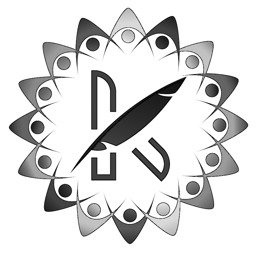
The Kaleidoscope newsletter serves as a testament to our school’s multifaceted and dynamic community, as well as an embodiment of the influence of writing and journalism to enlighten and motivate. The newsletter’s emblem, tagline, and the quill encapsulate our dedication to education, originality, diversity, unity, and inclusiveness.
The Kaleidoscope emblem showcases a purple letter “K” at its center, accompanied by a quill, which signifies the school’s devotion to education and learning, as well as the liberty to write and express oneself. The quill also symbolizes the impact of journalism to inform and inspire, a core principle of the Kaleidoscope.
Encircling the letter “K” and quill are figures with interlocked arms, forming a circle. This imagery conveys the unity, collaboration, and inclusiveness that the Kaleidoscope aspires to achieve. The figures are depicted in a recurring sequence of colors—brown, yellow, red, green, blue, and orange—representing the diverse school community.
The Kaleidoscope newsletter’s tagline, “Where Every Story Reflects a New Perspective,” highlights the value of sharing narratives and varied viewpoints. Writing and journalism play an essential part in bringing these stories to the forefront and keeping the community informed about significant issues and events.
Collectively, the emblem, tagline, and the quill embody the Kaleidoscope’s dedication to education, ingenuity, diversity, unity, and inclusiveness, as well as the influence of writing and journalism to enlighten and motivate. The Kaleidoscope serves as a platform where each story can be told, and every perspective can be valued, mirroring the true vibrancy of our community.